


Westside Toastmasters is located in Los Angeles and Santa Monica, California
Strategy 3: Use Superior Organization
Overview
A place for everything, and everything in its place.
- Samuel Smiles, author
No amount of outstanding content or effective delivery skills can save a poorly organized presentation. If the participants can't follow your presentation's organization or line of reasoning, they will assume that you don't know the material, haven't integrated it, are lazy, and don't deserve their attention. Therefore, adroit presenters spend a great deal of time not only developing the content and the delivery of their message; they also focus on developing superior organization. This chapter presents five techniques that will assure both you and your audience that your presentation is impeccably well organized. The five techniques are:
Developing advanced organizers.
Using the eight organizational structures.
Making sure it is cohesive.
Paying attention to your transitions.
Understanding the critical importance of timing.
1. Advanced Organizers
One of the exercises that we use in a negotiation course is an exercise in one-way and two-way communication. The exercise works like this: We select a participant from the course to be the communicator. He or she is given a diagram of seven shapes (circles, rectangles, and squares) that are connected to each other. Using one-way communication, the communicator must describe - in as much detail as possible - the figures on the handout, while the listeners draw the diagram to the best of their ability based only upon the verbal description. The communication can only be one way and the communicator cannot use hand gestures - only his or her verbal skills - to describe the shapes in the diagram. The participants are not allowed to ask questions.
The exercise is then repeated with a different diagram that uses the same shapes but in an equally difficult arrangement. This time, however, the communicator and the listeners can engage in two-way communication. The quality of the diagram always improves when both the listeners and the communicator give each other feedback. The attendees ask for directions to be repeated, and both parties develop a richer way of communicating using angles, degrees, clock numbers, and analogies such as "it looks like a wagon" to make the communication richer, more thorough, and more precise.
Every once in a while, a superb communicator volunteers for the role of describer. What is different about this communicator is that the volunteer intuitively understands the concept of advanced organizers. By this we mean that the volunteer will start by saying, "I am going to describe a grouping of seven shapes, there is one square, two circles, and four rectangles," or he or she will say, "I will describe the shapes and their sizes in a minute, but before I do that, I want you to know that I will be describing the shapes in a clockwise direction."
Advanced organizers create a frame of reference for what follows. When advanced organizers are used, the people reproducing the diagram are told how the communicator will proceed, that is, in a clockwise direction, and that the diagram is made up of seven shapes. Because the participants know how many shapes there are and in what direction the shapes will be described, it makes the whole process of understanding their task that much easier.
Just as the superb communicator in the one-way / two-way communication exercise used an advanced organizer to help the participants reproduce the diagram, deft presenters use advanced organizers to tell the participants how the presentation will proceed by giving them an overview of its structure. This structure also helps the participants organize the presentation in their own minds and, hence, remember it more effectively. Appropriate visual aids make the organizational structure more apparent to the listener. For example, how many times have you heard, "That was point number three," and you can't even recall that there was a point number two? That's why it is usually necessary to say at the outset how many points you will be making. Then, as each point is checked off, remind the listener: "That was point number two," while restating a key-word summation of the point.
Remember, it is not possible to be too clear. Research has proved that people both understand and remember information hierarchically. By using advanced organizers, skillful presenters help the attendees both understand and remember the presentation more effectively.
2. Eight Organizational Structures
It is impossible to give a strong presentation within a weak organizational structure. Therefore, proficient presenters have developed the art of organizing their presentations to the highest degree possible. Eight organizational structures that you can use are:
Chronological.
Geographical.
Analytical.
Functional.
Contrasts/comparisons.
Conflict.
Metaphorical.
Mixed.
Chronological Presentations
Chronological presentations are organized by time and progress from beginning to end. The unit of measurement can be seconds, minutes, hours, days, weeks, months, years, decades, centuries, and millennia. The movie JKF, most programs on the History Channel, and the acclaimed scientific series Walking With Dinosaurs are examples of masterful use of chronological events to tell the story in a logical or meaningful manner.
Chronological presentations are often used to tell a story. The book The Critical Path tells the dramatic story of Chrysler's survival, and Five Days in London tells the story of how Winston Churchill persuaded the war cabinet not to capitulate to Hitler. In terms of an economic example, a speaker could open with a "now" perspective, such as, "Today, interest rates for home mortgages are the lowest they have been in 50 years. How did we get here? Let's go back to 1953 and examine what happened." Then, with a simple timeline, tick off key developments on watershed years. This gives a flow of continuity and brings cohesiveness to your message. As a side note, in this kind of presentation, it can become deadly dull if all you do is reel off years and statistics. For color and depth, mention an occasional "scene-setting" event. For example, "In 1959, the Russians shocked the world with the launch of Sputnik, the first manmade satellite to orbit the Earth. In that same year, interest rates shot up as well ... "
Geographical Presentations
Geographical presentations use geographical places to help tell a story. One of the best examples is Pierre Burton's The Last Spike, which tells the story of the building of the Canadian Pacific Railroad. It is geographical because the story develops as the building of the railroad moves primarily from east to west. This story is also metaphorical in that it also tells the story of the building of a nation.
Analytical Presentations
Analytical presentations analyze the topic, divide it into meaningful sub-topics, and demonstrate the relationship between them. For example, "High-performance teams have the following eight characteristics ... " or, "The three disciplines of market leaders are ... "
Each sub-topic is supported by empirical evidence - the better the evidence, the better the presentation. Excellent evidence is surprising or unexpected, and the listener is rewarded by hearing the depth of the evidence and the thoroughness of the research.
Functional Presentations
Functional explanations help to deepen one's understanding and appreciation of how things work or the benefits to be derived by using a particular product or procedure. Speakers like Susan Sweeney and Jim Carole help their audiences understand and appreciate various aspects of the Internet and E-commerce. Or just flip on your television in the wee hours of the morning and you will be bombarded with speakers using functional organization: There is one on every infomercial. This is their stock-in-trade. After 30 minutes, they have told you every possible use of their product (and then some). They hold nothing back. If there is a function, you've heard about it by the time they finish.
Contrasts and Comparisons
Contrasts and comparisons actually work well together. For example, Dr. Janet Laap uses the power of contrasts and comparisons to help explain how Americans and Canadians are similar and different. She also uses humor when advising Canadians who speak in America and for Americans who speak in Canada. A subset of contrasts is doing a pro and con analysis. For example, suppose your company is equally divided over starting a marketing campaign now, because the competition is slowly taking market share away from your division's product, versus waiting six months to implement the plan, because a new innovative product is under development. We have found that when a topic spurs strongly held opposing points of view, it is desirable to first get agreement on common ground. Then acknowledge the arguments of the "opposite side" second, and advance your point of view last.
In terms of common ground in the previous example, the presenter may want to reiterate agreed upon principles of effective decision-making, the need to balance short-term and long-term goals, and the company's mission to be both innovative and profitable. The presenter would then consider the arguments for increasing advertising now: Market share lost now may never be made up, the company's board of directors and shareholders are becoming increasingly upset by decreasing market share, and the industry's yearly market share report will be published in six months. The presenter then presents the opposing point of view that the new product could become the new industry standard, but to be successful it will need every advertising dollar that the company can put behind it, including this year's entire advertising budget. Second, the company has a reputation of bringing innovate products to market and is overdue for a product that is a direct hit. Third, most companies fail because they overemphasize short-term profits for long-term growth.
Conflict
Using conflict to set up and organize your presentation is something that Craig Valentine, a World Champion of Public Speaking, recommends. He states that it seems to be human nature to like a good fight or a good conflict. He also points out that most movies introduce the audience to the conflict within the first 30 minutes. For example, it could be an intrapersonal conflict (conflict within oneself); an interpersonal conflict (conflict between two people); an intrateam conflict (a conflict within a team); interteam conflict (conflict between two or more teams); an intraorganizational conflict (conflict within an organization); and a conflict between two organizations, two states, or two countries. Many of the best stories a presenter can tell also revolve around the successful resolution of one or more of the different types of conflicts previously listed.
Metaphorical Presentations
The metaphorical presentation uses something that is well-known and understood to help the attendees understand something that is less well-known and understood. Greg Levoy uses the concept of connecting the dots in his presentation Callings. The metaphor of connecting the dots means that we have life experiences that are exceptionally meaningful for us. When we "connect the dots," that is, discover the deeper significance that can be derived from figuring out the relationship among these various meaningful life experiences, we discover our calling. It is in connecting the dots that the picture, or in this case, our calling, emerges stronger and more clearly focused.
Alan Parisse states that "the challenge of a presenter is to move from simplicity to complexity and then back to simplicity with depth." Metaphors are a good way to do this. Metaphors are also an excellent way to make your presentations truly universal, deeply personal, and imminently memorable.
Mixed Structures
Mixed structures use various combinations of the seven methods that were previously presented. Seasoned presenter Terry Pallson uses the story of how air transportation has changed to anchor his topic of change management. He uses pictures and words (Figure 3-1 and Figure 3-2) to illustrate the changes the role of stewardess has undergone since the 1930s.
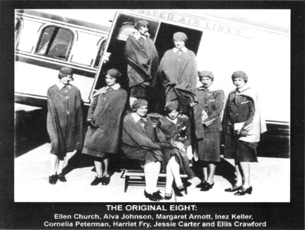
Figure 3-1
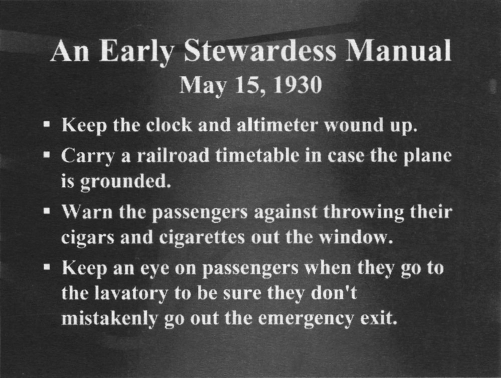
Figure 3-2
3. Make Sure It Is Cohesive
In the perfect symphony, the composer must make sure that every note that should be in the symphony is included and that every note that should not be included is excluded, as the following quotation from Leonard Bernstein so artfully points out.
We are going to try to perform for you today a curious and rather difficult experiment. We're going to take the first movement of Beethoven's Fifth Symphony and rewrite it. Now don't get scared; we're going to use only notes that Beethoven himself wrote. We're going to take certain discarded sketches that Beethoven wrote, intending to use them in this symphony, and find out why he rejected them, by putting them back into the symphony and seeing how the symphony would have sounded with them. Then we can guess at the reason for rejecting these sketches, and, what is more important, perhaps we can get a glimpse into the composer's mind as it moves through this mysterious creative process we call composing.
We have here painted on the floor a reproduction of the first page of the conductor's score for Beethoven's Fifth Symphony. Every time I look at this orchestral score I am amazed all over again at its simplicity, strength and rightness. And how economical the music is! Why, almost every bar of this first movement is a direct development of these opening four notes: [ ... ]
And what are these notes that they should be so pregnant and meaningful that whole symphonic movement can be born of them? Three G's and an E flat. Nothing more. Anyone could have thought of them - maybe ...
Just as the perfect symphony has included all of the notes that should be included and has not included any notes that should in fact be excluded, superior presenters do the same with their words. This is much easier said than done. How do masterful presenters make sure they have developed a cohesive presentation? The following seven steps will help guarantee that your presentation is as cohesive as possible:
Step 1: Write a Mission Statement
Write a mission statement for your presentation and decide if each bit of the content advances that mission or not. For example, Aaron Ropeik's mission is to help people make smarter and safer decisions in regard to accurately assessing and acting on the risks that they encounter. Similarly, Jack Welch's mission while president and CEO at General Electric was that GE would be the first or second best in each market division where it sold products or GE would pull out of that division. The mission statement for your presentation will help you stay on target and focus your message. It also makes it easier to get feedback from others as to whether or not you are achieving your goals.
Step 2: Develop Goals and Objectives
Develop your goals and objectives for your presentation and decide whether each bit of the content is aligned with them. For example, "When you leave here today, you should be able to ... " [enumerate the objectives]. You can also remind the listener of the value you are providing by having a visual trigger such as a flip chart checklist, and check off each objective as you address it.
Step 3: Formulate and Answer Central Questions
For example, in a presentation on time management, the presenter might use "How can we do more in less time?" or "Have you ever considered the power of the ‘Not to do list’?" or, "Are there ways that we can increase market share without adding additional costs?"
Step 4: Diagrams as Aids to Clear Thinking
Even if you don't use them in your final presentation, creating diagrams, such as flow charts and storyboards, can help to make your presentation preparations clearer and better organized. An organizational technique Aaron uses is a simple circle. He shows the central thesis - his reason for speaking - at the top of the circle, as if it were occupying the 12 o'clock position on a clock face. Each supporting point then falls in sequence around the circle in clockwise rotation. Thus, each point can be seen in a clear sequence, culminating back to the central thesis. You could use a straight line rather than a circle, but the connection between your opening and your closing would not be as clear - or might not exist at all.
Step 5: Test the Presentation
Test your presentation with friends, fellow presenters, and/or an audience and ask for feedback about what should be included and/or excluded. You can also ask about specific parts of the presentation.
When Mark Victor Hanson and Jack Canfield published their Chicken Soup for the Soul series, they collect a large number of stories. They then use a focus group to rate the stories on a scale of 1 to 100, and the highest-ranked stories were selected to appear in their books. Therefore, one way to test market the content of your presentation would be to ask a focus group of your friends and/or colleagues to help you select the content and structure of the presentation.
Warning: Give your focus group a specific task and keep a tight rein. If you open your presentation to scrutiny by too many free-thinking, free-wheeling people, you could end up with a committee rewriting your presentation, and that would not be good for anyone.
Step 6: Successive Approximations
Successive approximations means that although the presentation will never be 100-percent cohesive, each time you work on it and/or get some great feedback, it will get better and better and closer and closer to its ideal form.
Step 7: A Call to Action
What do you want your audience members to think, feel, and/or do as a result of attending your presentation? If you cannot specifically answer these three questions, you are categorically not ready to present. For example, in David's business writing presentations, he tells the participants, "As a result of today's program, you will be able to write a business letter more clearly, concisely, and confidently."
In your next presentation, what do you want the participants to think, feel, and/or do differently as a direct result of attending your presentation?
I want my audience members to think ...
I want my audience members to feel ...
I want my audience member to do ...
4. Transitions Are the Keys to Clarity
Transitions are the keys to separating your ideas and achieving clarity. Transitions signal to the audience that the presenter has finished one topic and is about to begin the next. Transitions also give the presenter time to integrate previous material to compare and contrast, cite trends, or have a short mental break before starting the next topic, or to signal to the audience that you are transitioning from the opening to the body or from the body to the conclusion. In other words, transitions are integral to the success of any presentation.
Transitions are as important as your content - even the world's best content is received poorly if you do not pay enough attention to the transitions. In fact, if you have ever lost your place when speaking, it was almost certainly a result of a poorly formed transition. Presenters usually can explain their key points, but it is in the process of getting from one point to the next that we tend to lose our way.
Transitions allow you to summarize what has just been said, to alert your audience that there will be a change in topic, and to give the audience a break, time to relax, and/or to digest the previous topic and get ready to actively participate in the next.
Transitions as Summaries
It has been said that we have to hear something seven times before we can remember it. Transitions provide an excellent opportunity to go over the content one last time. The transitional summary also allows the audience members an opportunity to see and appreciate the value of the content and what they have learned from attending the presentation. These summaries also afford the listener the opportunity to think about how the content can be linked together. The summary can also present the material in a slightly different way that may be clearer and more understandable for the participants.
Transitions as Signposts
Transitions can act as signposts telling the audience what material will be presented next. They act as an advanced organizer, which will help the participants organize the material hierarchically and hence remember the material better.
Transitions as Breaks
Sean: Some time ago, I was swimming in a Masters Swim Program. The Masters Swim Program is for adults who want to stay in shape. We entered the pool at 6:30 a.m., two mornings a week. The coach was fantastic, and we were all making a great deal of progress. I swam more laps than I ever thought possible and between sets, that is, between different types of strokes or repetitions of the same stroke, we were allowed to rest - that is, the coach gave us 17 seconds to rest. Now 17 seconds is not a lot of time. However, I learned to relax more effectively than I ever thought possible during those 17 seconds. In fact, you could say that we learned to relax as effectively as we learned to swim.
Just as the 17-second break helped the swimmers recuperate, and therefore swim as effectively as they could, effective presenters know when to give their audience a break, to catch up, integrate, and reflect on the material being presented. Amateur presenters just keep right on going.
Aaron: When I first started presenting full-day seminars, I assumed that the audience paid for a six-hour program, so I planned on giving them six hours of information. What a mistake that was. I found that no matter how good the information was, or how well it was presented, at about the four-hour mark, people began to tune me out. I didn't realize I was oversaturating them. I had yet to learn the power of the mental break. Of course, we are always mindful of the need for physical breaks, but superb presenters are thoughtful in providing mental breaks. A mental break can be as simple as a quick joke or a short, fun exercise. Does it have to relate specifically to the point you were making? Not necessarily. But it must be fun.
I found, to my surprise, that when I started adding in frequent fun moments, the listeners' comprehension and retention went way up. As a result, they learned and took with them more knowledge, even though I was presenting less information.
The necessity to allow for rest breaks, integration breaks, and reflection breaks is one of the techniques that presentation coach, Betty Coper teaches which she calls "HUD". HUD stands for Hear, Understand, and Digest. Therefore, in addition to acting as signposts that guide both the presenter and the audience through the presentation, transitions also play an important role in giving the audience a break so they can learn from the presentation or digest the information as effectively as possible.
6. Types of Transitions
Transitions are aids to clear thinking and effective presentations. Now that we have outlined the purpose of transitions, we will next discuss six proven transition techniques to separate your ideas. They are:
Delineation.
Words and phrases.
Pictures.
PowerPoint.
Voice.
Body language.
1. Delineation is the simplest way to make a transition. The presenter simply states that he or she will be covering three main points. For example, the speaker says, "The first area of interest is our competitor's new marketing strategy; the second point is how our firm will counter our competitor's new strategy; and the third point is how we will measure our effectiveness." It is also likely that each of the main points will have sub-points and each of the sub-points will have to be delineated from each other as well as from the main points.
2. Words and phrases can also be used to indicate a transition from one topic to the next. We are all familiar with words and phrases such as next, the following example, point one, point two, point three, or phase one, phase two, and phase three, and as you have seen in this resource, Strategy 1, Strategy 2, etc.
3. Pictures can indicate to the audience that you are leaving the present topic and moving to a new topic. Two presenters that we have seen who are superb at using pictures as transitions are Richard Bolles and Janet Laap.
Richard Bolles is the most widely read author on finding a job. In fact, his best-selling book What Color Is Your Parachute? is a classic in the field. In both his book and in his presentations, Bolles uses old pictures that are no longer copyrighted to masterfully signal to his audience that a transition is taking place. Two examples of the pictures Bolles uses to signal a transition are as follows:
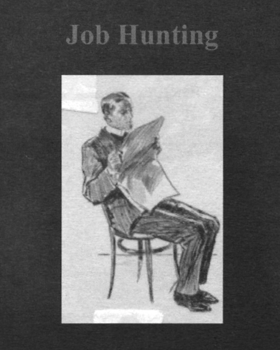
Figure 3-3
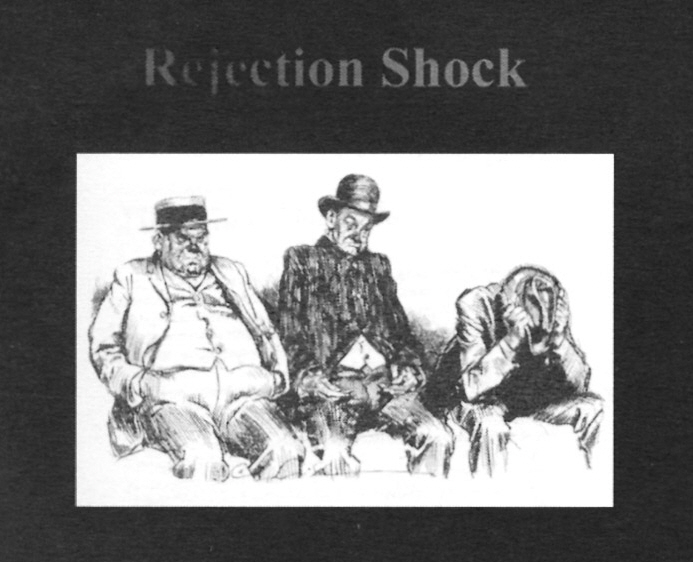
Figure 3-4
Sean: The one thing that Janet Laap does that impresses me the most is that she is a master at transitions. For example, Janet uses slides of black and white pictures as transitions between topics. What I liked so much about Janet's use of these pictures was that they signaled a clear transition between one topic and the next, and at the same time let the audience have a very short relaxation break, and/or use the time to integrate and/or reflect on the material that had just been presented. This is Betty Coper's HUD principle, which stands for "letting your audience Hear what was said, Understand what was said, and Digest what was said." This time it uses pictures in place of verbal pauses.
Figure 3-5

Figure 3-6
Please outline how you could make better use of pictures in your presentations.
4. PowerPoint lets you use a specific type of slide or color scheme to indicate that you are making a transition in your thoughts and/or ideas, in addition to having a specific type of slide title that tells the audience that you are changing topics. Other useful techniques to indicate transitions in PowerPoint are to use a puzzle, headers and footers, and pictures within the PowerPoint slide. For example if you are going to use puzzles, the overview shows the completed puzzle (Figure 3-7). Then each piece of the puzzle represents a transition from one topic to the next.
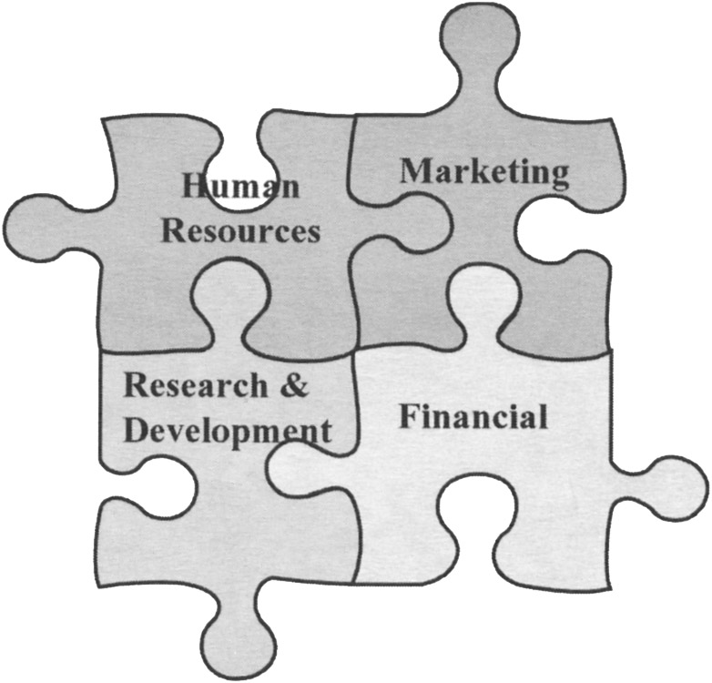
Figure 3-7
One of the most unusual uses of pictures in transitions was a presentation Sean attended by Dr. Terry Pallson. Terry presented at an annual meeting of the National Speakers Association in Dallas, Texas. Even for a seasoned professional speaker, this is one of the most nerve-racking presentations he or she will ever have to give because it is in front of peers, and because this is an extremely well-attended meeting, with more than 2,000 participants. If the speaker does well, it will be remembered for years, if not, it will be remembered for decades.
The picture Terry used was of a handmade quilt with different sections of the quilt representing the topics he was going to speak about, such as achievement, heroes, wisdom, purpose, change, and relationships. It was an exceedingly good choice for a couple of reasons. First, quilts remind us of the care and dedication that went into making them. They have a warm and cozy feel, and they take on a special meaning for us, for example, when a grandmother makes a quilt celebrating a special occasion such as a wedding or a birth. It is also no accident that a great deal of awareness and empathy was deservingly created for people who died of AIDS with the National Quilt Project. Terry used the quilt slide to organize his presentation, to make clear transitions, and to give the audience members time to reflect on the materials that had just been presented in the previous section.
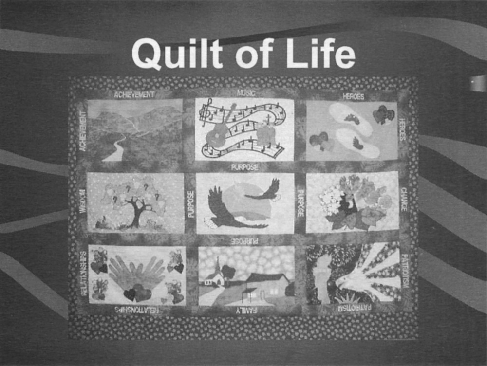
Figure 3-8
What we liked so much about Terry's use of that picture was that it signaled a clear transition between one topic and the next, and at the same time let the audience have a very short relaxation break, and/or use the time to integrate and/or reflect on the material that he had just presented.
David Paradi uses footers at the bottom of his PowerPoint presentations. This particular presentation had five sections: Overview, Research, Strategic, Programs, and Customer Service. Each word was highlighted with a box that appeared around words indicating to which section Aaron was speaking. As well, the movement from section to section subtly reinforced the transitions. Also note that Aaron used pictures in addition to the highlighted words to indicate a transition to a new topic within his presentation. Here is an example from one of Aaron Paradi's presentations:
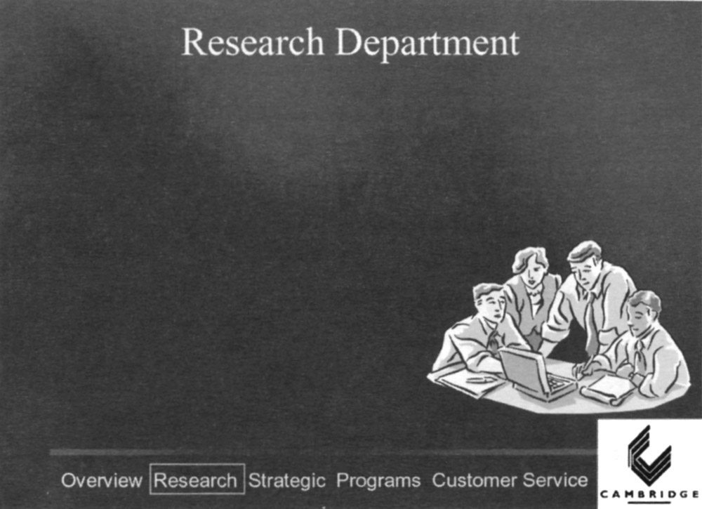
Figure 3-9
5. Voice allows you to use pauses, changes in tone, or different volumes to emphasize a change from one idea to the next. Most speakers underestimate the length of their pauses because they are uncomfortable with silence. Highly proficient presenters on the other hand are comfortable with the four-second pause. In order to reach the desired length, at first you may have to count silently to yourself: "one locomotive, two locomotives, three locomotives, four locomotives." Perhaps an even more effective way to measure your pauses is one espoused by Dave McIlhenny. He said, "Don't count your pauses in seconds, count them in heartbeats." Thus, he taught presenters to "give it a full four-heartbeat pause." To become more comfortable with pausing, count the length of the pauses when observing skilled agile presenters. Also practice the same transition while speaking into an audio recorder or smartphone, and experiment with different pauses. Listen to the results and solicit feedback from others. When we teach a presentation strategies course or when we coach speakers individually, we help them learn to pause by silently counting. This is a relatively simple change, yet the results are astounding.
After you have mastered the pause, the next technique that Sean was taught by Betty Coper, is the graduated pause. The graduated pause is used when you are introducing three or more main points of wisdom. After the first point, you use a one-beat pause; after the second point of wisdom, you pause for two counts; and after the third point, you pause for three counts. The net result is to build suspense, and the suspense builds impact. Another vocal technique is to use different volume to emphasize movement from one topic to another.
Sean: Another vocal technique is to use different volume to emphasize movement from one topic to another. For example, I illustrate building the world with creative or wasteful solutions by comparing two airports. The first airport was well planned and well used. The second was poorly planned and became a white elephant. I speak about the creative problem-solving that was behind the first airport in a loud and vibrant tone of voice. I then say, "You can contrast that with Mirabel [the white elephant]." However when I say, "You can contrast that with ... " I say it with a much softer tone of voice to emphasize the contrast with my tone of voice as well as in the words themselves. In addition, you can also use different voices to mimic different people speaking about different ideas.
6. Body language, including the use of gestures and movement, can be an incredibly effective method to signal transitions. For example, you can use your fingers to reinforce the first, second, and third points. You can also use different parts of the stage. For example, you can move to the center of the stage, pause, and deliver your point of wisdom, conclusion, and so on. If you are talking about a difference of opinion between two experts in any given field, you can give expert A's point of view from center stage left, then give expert B's point of view from center stage right, and then move to center stage forward to give your point of view or to ask a profound question of the audience.
As you can see, these techniques can be combined to add even more emphasis. In the last example, when the presenter moved to center stage forward to deliver his or her conclusion, he or she could move to center stage forward, then pause, and add extra volume. All three of these techniques, moving to center stage forward, pausing, and increasing volume helped to differentiate the conclusion from the main body of the presentation.
Part I: Look specifically at how seasoned presenters use both single and multiple techniques to develop clear transitions from one idea to the next and from one topic to the next, and from one part of their presentation (for example, from beginning, to the middle, or to the end) of their presentation. Please list three specific techniques that made these transitions effective.
Part II: In the next section, please outline three specific techniques that you will use to make your transitions more effective.
5. The Critical Importance of Timing
If you are going to be a part of a conference or series of presentations, always ask to see the entire program. Sean was participating in a conference and the organizers only allowed for a 15-minute break in the afternoon. What they and all of the rest of the speakers didn't anticipate was that the ratio of female attendees to male attendees was about 10 to one. This meant that the washroom facilities were totally inadequate for the women who had attended. Breaks ended up being longer than scheduled. Add to that the fact that some presenters went over their time and Sean and the last speaker only had 30 minutes each to do their presentations. Among the lessons that Sean learned were to expect the unexpected, be prepared to be flexible, know what you can leave out, and audiences will forgive a number of things but going overtime is usually not one of them. In other words, you have to know and understand the structure of the presentation so well that you can change it on a dime so it will be just as seamless as the longer one would have been.
Ed Tate, the 2000 World Champion of Public Speaking, recommends preparing two versions of every presentation - a full-length version and a 10-minute version. This way, he says, if the time for the presentation is cut, you can go to the shorter version confident that you will still be able to make your most important point.
Aaron: This is a lesson I learned the hard way. I was invited to deliver a 45-minute keynote address for a conference that was supposed to start at 8 a.m. on a Saturday. I arrived at the venue Friday night and met the conference organizer. I said, "I just want to verify that I will be speaking tomorrow from 8 to 8:45" She said, "Well, the opening session starts at 8." I said, "So what will take place before me?" She said, "There will be a flag processional, the pledge of allegiance, an invocation, a welcome from the district governor, a proclamation from the Mayor ... ." At this point, I said, "So what time will I start?" She said, "About 8:35." I added 45 minutes to 8:35 and said, "So you want me to stop at 9:20?" She said, "Oh, no! We have to be out of here by 8:45!" My 45-minute presentation had suddenly shrunk to a 10-minute presentation.
A participant in a course of ours made one of the finest presentations we have ever seen. The presentation was a perfect summary of the importance of superior organization and timing to illustrate his message. Even more interesting, it was not a presentation by a nationally known speaker.
The participant, Sandy, purposely misled the audience as to the topic, which he said was time management. Sandy placed a Styrofoam cup on a table at the front of the room. He then asked a rhetorical question: "How long would it take to smash a Styrofoam cup?" The estimates lasted from three to seven seconds. Sandy then smashed the cup on the table, which made a loud explosion. The noise and the subsequent startled response was enough to make sure that everyone in the audience was fully alert when he announced that the time it took to completely destroy the cup was 0.7 seconds.
Sandy then took us through the anatomy of a car accident where he graphically explained what would happen to the car and its occupants during the 0.7 seconds it took for a high-speed impact. The organization of the presentation was chronological. Sandy showed seven slides, depicting what would happen at 0.1 seconds, at 0.2 seconds, at 0.3 seconds, all the way to 0.7 seconds. Each slide had a picture of what was happening to the car and its driver at each one-tenth of a second. The pictures were somewhat blurry so as not to be so gruesome that the audience would not be able to process the cognitive message Sandy was trying to get across. The pictures were further muted as the text appeared and he explained what was happening during each tenth of a second. Sandy then ended his presentation with a call to action, that all vehicle drivers and passengers should wear seat belts at all times.
Why was this presentation so powerful? First, it had the element of surprise - the smashing of the cup. Then it had the perfect segue: seven-tenths of a second to smash the cup being perfectly analogous to the seven-tenths of a second it takes to smash a car. Lastly, the presentation was perfectly timed and organized using one-tenth of a second increments to explain what happened to the car and its occupants at each tenth of a second, and it ended with a clear call to action - wear your seat belts at all times.
As this chapter illustrates, a good presentation begins with good content, but good content without good organization is nothing but a jumble of competing ideas, examples, and images. Once your content and organization are top-notch, you can move on to the finer points of dynamic delivery - which is the topic of our next chapter.
Westside Toastmasters on Meetup